Showing posts with label Property Prices. Show all posts

Thursday, 4 October 2018

Modelling Melbourne Property Prices with Light GBM

This is a continuation of the first part where I visualised the property price data of Melbourne (link). This time I used the full dataset with prices and property data dating from Jan 2016 to Aug 2018 to create a model that is capable of predicting property prices in Melbourne.
Here is what the data look like:
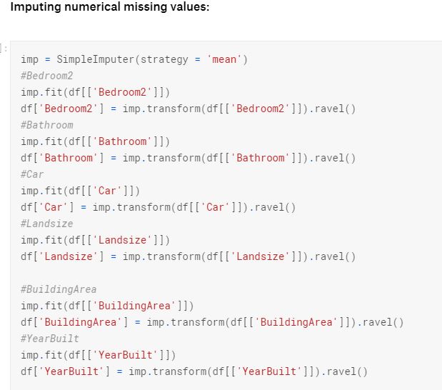
There are 27247 property transactions with 21 features, including price, in the dataset. In my model, I dropped "Lattitude" and "Longtitude" [sic] since there are so much missing data. I created unique street names by extracting them from the addresses and combining them with suburb names. I also imputed some essential missing data using means.
I separated the data into training and testing sets. I used a gradient boosting algorithm to model the prices. Here is a good tutorial on the algorithm - Link. The algorithm is released by Microsoft and is available in both Python and R. This is what the predictions look like against the prices of the testing set:
I also plotted the features according to their importance/prediction power:

The most important features affecting house prices in Melbourne are:
  • Distance from CBD
  • Postcode
  • Dwelling type
  • Number of rooms
Distance from CBD is by far the most important feature. Unlike our visual analysis in Part 1, latitudes and longitudes were not used in the model here, but instead, we used features that are related to latitudes and longitudes: Postcodes, Suburbs and Council Area.
For me, the most suprising part is that the number of rooms in a property has a higher impact on the price than landsize or built area.


To see how I did everything step by step, please refer to my Jupyter Notebook on Kaggle:https://www.kaggle.com/wlsamchen/melbourne-house-price-modelling-light-gbm

Saturday, 29 September 2018

Melbourne Residential Property Prices - Visualised

I am a Sydneysider and I did not know much about property prices in Melbourne, except that they tend to be slightly cheaper than that of Sydney. There is an up to date dataset on Kaggle on residential properties sold in Melbourne from January 2016 onwards (link: https://www.kaggle.com/anthonypino/melbourne-housing-market).

I decided to take a look at what the average (mean) prices are in the most expensive and most affordable suburbs are like:


As we can see from above, the most expensive suburbs are 4 to 5 times pricier than the most affordable suburbs.

Next, I decided to create some sort of a map that shows property prices. I divided the prices into 8 categories and plotted them by their latitude and longitudes (for the properties with coordinates data). The resulting scatter plot is a map of Melbourne:

Note: Latitude and Longitude are spelt wrong because the data columns were named as such.


The CBD is a at approximate the middle of the plot (-37.8, 145.0). As you can see, there is a clear divide: properties to the east and sout east of the CBD are pricier than those of the west and north. Properties closer to the CBD are also worth more.

There will be a separate post on predicting the prices of properties and the most important features affecting property prices in Melbourne.

Full Code Below: Melb Property Visualised

Import Libraries

In [1]:
import pandas as pd
import numpy as np

import matplotlib.pyplot as plt
%matplotlib inline
import seaborn as sns

import datetime

Import Data and Preparation

I want to visualise the last 12 months of data from August 2017 to August 2018.
In [7]:
df = pd.read_csv('../input/Melbourne_housing_FULL.csv')
df = df[df.Price.notnull()]
df.head()

df['Date'] = df['Date'].apply(lambda i : datetime.datetime.strptime(i, '%d/%m/%Y'))
begin = datetime.datetime.strptime('31/8/2017', '%d/%m/%Y').date()
end = datetime.datetime.strptime('1/9/2018', '%d/%m/%Y').date()
df = df[(df.Date> begin) & (df.Date< end)]
df['Date'].head()
/opt/conda/lib/python3.6/site-packages/ipykernel_launcher.py:6: FutureWarning: Comparing Series of datetimes with 'datetime.date'.  Currently, the
'datetime.date' is coerced to a datetime. In the future pandas will
not coerce, and a TypeError will be raised. To retain the current
behavior, convert the 'datetime.date' to a datetime with
'pd.Timestamp'.
  
Out[7]:
19741   2017-09-03
19742   2017-09-03
19744   2017-09-03
19745   2017-09-03
19746   2017-09-03
Name: Date, dtype: datetime64[ns]

15 Most Expensive Suburbs

In [18]:
Top15 = pd.pivot_table(df, values = 'Price', index = 'Suburb', aggfunc = 'mean').reset_index()
Top15 = Top15.sort_values(by = 'Price', ascending = False)[:15]

plt.figure(figsize = (20,10))
sns.set(font_scale=2)
sns.barplot(y = 'Price', x = 'Suburb', data = Top15)

plt.xticks(rotation=90)
plt.xlabel('Suburb')
plt.ylabel('Average Price of Property Sold')
plt.title('Most Expensive Suburbs in Melbourne Aug2017 to Aug2018')
Out[18]:
Text(0.5,1,'Most Expensive Suburbs in Melbourne Aug2017 to Aug2018')

15 Most Affordable Suburbs

In [19]:
Bottom15 = pd.pivot_table(df, values = 'Price', index = 'Suburb', aggfunc = 'mean').reset_index()
Bottom15 = Bottom15.sort_values(by = 'Price', ascending = True)[:15]

plt.figure(figsize = (20,10))
sns.set(font_scale=2)
sns.barplot(y = 'Price', x = 'Suburb', data = Bottom15)

plt.xticks(rotation=90)
plt.xlabel('Suburb')
plt.ylabel('Average Price of Property Sold')
plt.title('Most Affordable Suburbs in Melbourne Aug2017 to Aug2018')
Out[19]:
Text(0.5,1,'Most Affordable Suburbs in Melbourne Aug2017 to Aug2018')

Plotting Houses by Price Category and Location

Before we create the plot, we first need to create the pricing categories.
Let's check out the pricing distribution of Prices first:
In [20]:
df['Price'].describe()
Out[20]:
count    1.088600e+04
mean     1.040665e+06
std      6.370919e+05
min      1.120000e+05
25%      6.400000e+05
50%      8.600000e+05
75%      1.260000e+06
max      1.120000e+07
Name: Price, dtype: float64
Let's create Pricing Category of <250k, 250k-500k, 500k-800k, 800k -1M, 1M-1.5M, 1.5-2M, 2M-3M, and >3M:
In [26]:
def priceCat(i):
    if i<250000:
        cat = 'Sub 250k'
    elif i>250000 and i<500000:
        cat = '250k to 500k'
    elif i>500000 and i<800000:
        cat = '500k to 800k'
    elif i>800000 and i<1000000:
        cat = '800k to 1M'
    elif i>1000000 and i<1500000:
        cat = '1M to 1.5M'
    elif i>1500000 and i<2000000:
        cat = '1.5M to 2M'
    elif i>2000000 and i<3000000:
        cat = '2M to 3M'
    else:
        cat = '3M+'
    return cat

df['PriceCat']= df['Price'].apply(lambda x: priceCat(x))
df['PriceCat'].head(15)
Out[26]:
19741      1M to 1.5M
19742    250k to 500k
19744      1.5M to 2M
19745      800k to 1M
19746      1.5M to 2M
19747      800k to 1M
19748      800k to 1M
19749    500k to 800k
19750      1M to 1.5M
19751             3M+
19752    250k to 500k
19753      800k to 1M
19754      1M to 1.5M
19755      1M to 1.5M
19756      800k to 1M
Name: PriceCat, dtype: object

The Scatter Plot

In [47]:
df=df.sort_values(by = 'Price', ascending = False)
sns.set(font_scale=1)
sns.lmplot(x='Longtitude', y='Lattitude', data=df[df.Lattitude.notnull()],
           fit_reg=False, 
           hue='PriceCat',
          palette = 'rainbow')
plt.figure(figsize = (20,20))
Out[47]:
<Figure size 2160x2160 with 0 Axes>

Portfolio Optimisation with Python

 Recently I have been busy so I have been neglecting this blog for a very long time. Just want to put out some new content. So there is this...